
Classical order has been with us for millennia in one form or another, exerting extensive cultural influence on our lives. Our language itself is built to great extent on Greek and Latin roots. As an order it is not just a style but a system of controlling space and relationships within that space, having its own language and references, that, by extension, regulates our place within that space, our relationship with the powers who deploy it, with each other, even shapes our ways of thinking about space itself. The order has also proliferated in diluted interpretations that at best are merely sentimental as well as been distorted to create monsters.
But it is the order of demos as well as empire. In the United States, since its early history, various classical revivals have been used not only to structure the growth of political institutions and represent their power but also to build independent homes, schools, churches, and civic buildings, large and small, giving them presence, balance, and ceremony. These contain and support the American spirit, housing its energies and contradictions. They are a vital part of our heritage. White columns and accents are often combined with red brick walls, and I have always found the contrast attractive. The brick gives the mass of the buildings body and texture, bringing them down to earth literally, touching our substance figuratively.
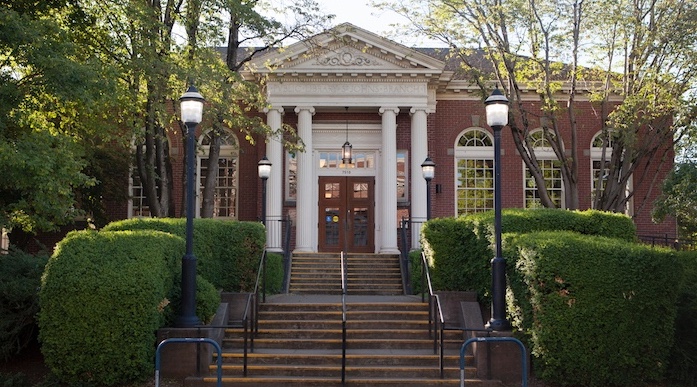
St. Johns has several such buildings, including its branch of the Multnomah County Library, above, picture via its site. Built over a hundred years ago, the library is a modest building that has stood up well and continues to contribute to the heterogeneous complexion of the neighborhood. For this effort I wanted to give bricks and columns a shot in another version of my mixed-use community center project, one that references those buildings as well as distinguishes itself as a place of significance yet remains on our level. See my first post Centering a Town: St. Johns/First Efforts for site, plan, and program.
Modern construction technology rendered columns obsolete; modernist reactions relegated them to archaism; postmodernism only referred to them with irony and whimsy. Yet none of those have given us a common language full enough to express our desires and complexities. The first two have cut us off from our past, the last trivialized it. I wondered if there weren’t some way to reinterpret classical order for a building that might still speak to us now. This won’t be it—I’m just experimenting.

Proportions mattered to the Greeks and Romans, representing higher understanding of nature and esthetics, both related in their eyes. Vitruvius wrote a treatise defining them, based on observation of actual buildings, that Vignola codified and illustrated for the Renaissance, laying out dimensions and interrelationships. There is common esthetic sense here. A column of a certain diameter looks flimsy if too tall, squat if too short. I found with the pieces and scale I used I could go up two stories, resulting in columns very close in height to Vignola’s ideal for the Doric order.
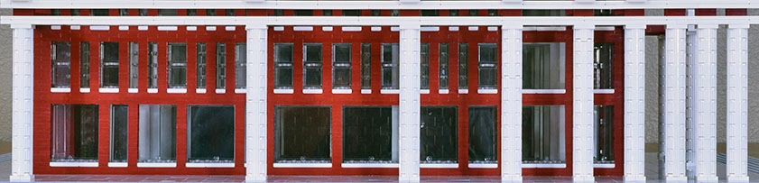
I then arranged the columns with their spacing determined by the first numbers in the Fibonacci sequence—1, 1, 2, 3, 5, 8, 13, 21—excluding 0. I used the width of the narrowest Lego brick as the base unit. I measured distance between columns, not between their centers, which would have made a difference. But there are no rules or precedents here that I know of. The row intrigued me, and I wanted to see where I could go from there.
The Fibonacci sequence is determined by a simple formula that essentially adds two previous numbers to make the next. It appears in nature and has occupied mathematicians for centuries. The Wikipedia entry gives full explanation. It has also been used to create a system of proportions very close to that determined by the golden ratio, as pictured in the golden rectangle, well known in spatial analysis of the Parthenon.

And has been used for design. Image via Designers Insights, where there are examples of application in page layout. In fact the proportion of two consecutive Fibonacci numbers, as they approach infinity, approximate the golden ratio. I’m skeptical of the validity of such systems, however, as only the first numbers of the sequence are practical. The sequence expands quickly and greatly—34, 55, 89, 144, and so on—numbers too large to be of use.
At any rate, I’m not using the sequence as a system of proportions—site dimensions and the program of the building went against it—but as a way of representing distance and movement. There is the energy of quick acceleration in this arrangement—or deceleration if you’re looking towards the start—movement that is not symmetrical and static but dynamic, and with the movement a kind of apparent order, a regularity that yet is irregular, an unpredictable mix of odd and even numbers. The sequence, generated by a formula, could also represent generation, energetic growth.
To say this order is natural, as many have, takes us to places where we are no longer certain or comfortable. We have never had good ways to talk about our relationship to nature, and our rational schemes have always fallen short. The sequence is as much a quick leap into uncertainty, yet a managed one.
The columns serve no structural function whatsoever. But they are not ornamental, either, as they stand separate for the most part and really embellish nothing. They contribute, rather, to the concept of the building and its relationship to its space. That is what I wanted, something to engage and activate the space of the plaza as well as give the building its own dynamic. The columns direct us to the the front, the main stage of the building, to entry to the black box theatre. They also lead to and accentuate the corner of Lombard and Philadelphia, which, as I argued before, is a significant public space and center. They also direct traffic flow. Those entering from Philadelphia will be channeled near the large windows on the side, where there are exhibitions, and kept there as the columns tighten until released at the front.

Corner buildings present their own design challenges, especially on a plaza. The side should be more than an incidental face, as it has large public exposure alongside a main street and before the plaza. Double entry at the corner is one solution. I suppose I could have temple entries on both front and side, though I couldn’t find classical precedents. My side remains a side, without entry, but it is active in its presence and complements the irregular shape of the plaza.
Entablature is abstract, with simple planes for the architrave and cornice and a seemingly invisible frieze, made so by the supporting beams the same color of the brick wall. I like to think of the cornice as floating. I’ve added diagonal supports at the columns that reach the building, suggesting a roof and anticipating the pediment at the front. From the side it looks, in fact, like a temple, save for the spacing.
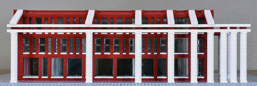
Completing the building with a pitched roof would have made the building too large and it wouldn’t have fit in with the essentially horizontal buildings nearby. A colonnade couldn’t be built on the other side as this building shares a common wall with the one next. It has to fit with a line of contiguous buildings along Lombard and at the same time command the plaza. The structure, as is, invites completion, however, and encourages comparison.

And what that comparison might represent. It is the partial Parthenon that has most engaged our imaginations the last centuries, though, not the painted gem. But in place of ruin I offer an incompletion that is intact and offers the possibility of structure, of imagined completion. That possibility, however, is countered by another that take us in another direction.
Perversely, given Portland rain and summer days of sun, I haven’t provided overhead covering for the colonnade. I like the open look, however. Adding a canopy of some sort at the second floor that doesn’t block view from the windows would make it quite functional. A building with arcades front and side might suit the site better, and perhaps will become a later effort.
On the building proper I match the width of the columns—two units—vertically at the same place as the columns in front and horizontally between floors. Within the created sections there is variety without predictable order. The vertical brick members within the sections all have a width of one unit. The only rule I followed inside these sections is that no window shares a common vertical brick element one floor to the next. The large plate glass windows on the first floor are meant for exhibition. On the second and third floors, the classrooms, I mix windows of one and two units, also in no apparent order. Curiously, without relevance, and not reflected in my design, the Fibonacci sequence measures in Sanskrit prosody the possible variations of long—two units—and short—one unit—syllables for any given cadence. For example, in a cadence of length six there are 13 possibilities. See the Wikipedia entry for explanation. The effect of all this variety is activity, an invitation to question, perhaps away from set ways.
I’ve kept the program of my second effort. The two sets of plate glass windows on the corner reveal the open space floor to ceiling where there is a spiral staircase that leads to the classrooms on the upper floors, via a system of platforms. Ascent in the building occurs close to and within view of the compressed columns at the start of the sequence, the point of focus.

The rear, once more, is problematic. The building has a service road that runs against this side, and the left part of the side is obscured by a burger place. The right part, however, is quite visible, the first part of the building one sees exiting the St. Johns Bridge, so should have some kind of presence. I added embedded pilasters the same height as and in line with the last column on the side and reversed the sequence—21, 13, 8. Almost. The last section is 6 units wide, not 5.

The pilasters preview what is to come once one reaches the side. Or it could be considered starting another series like the one on the side, perpendicular to it, another axis that extends to infinity. A friend suggested extending both series one more column each, 34 feet, with isolated columns that would stand in the plaza.

As one moves around the side, the columns present changing aspects.
When looks down the expanding colonnade from the front corner, one is led to sight of the St. Johns Bridge.

And beyond. Continue running the sequence—233, 377, 610, 987, 1597, 2584, 4181, 6765, 10946, 17711, 28657, 46368, 75025, 121393, 196418, 317811, and so on. Quickly one is taken to vastness. It’s the other concept suggested in the building. Against containment by the implied temple, the suggestion of infinite space, unconfined. One is invited to think of one’s place in the universe, its possibilities, its uncertainties. The tension between the two proposals defines the building. Yet one does have a place, and it is set by the compressed columns at the start, at the center of the neighborhood.

The side colonnade opens up at the front, where passersby can enter the plaza and move on. Or they are invited to enter at a face where these is stasis, resolution, and formal invitation. The windows on the left corner, revealing the spiral staircase, match those on the side. They also adhere to the Fibonacci sequence, though I have omitted columns at 1, 2, 3, and 5. There the sequence stops. The four columns, in line with the first on the side, are symmetrical and present a standard temple front. Again perversely I haven’t added covering for the space between.
The entry is off-center, but it would be centered were a similar colonnade constructed on the right side, impossible, once more, because of the common wall. Having it on the right also counterbalances the visible parts of the colonnade on the left side. It is a large entrance that represents its importance and the space within, as well as the significance of the building itself. The height of the doors and windows match the interior, open for two floors, an area that serves as a lobby for the theater and exhibition space.
The temple front is incomplete as well, lacking the expected pediment. I tried adding one with two diagonal pieces atop the entablature at entry, and it fit perfectly with the line of the roof. It suggested a building that was disproportionately wide, however. More, it went against the concept of the building, presenting a finality that went against the absences and implications elsewhere.

And I thought about going further, adding the pediment, centering the entry, and evening the spacing between windows and columns, as well as making other changes in proportions and layout. The order has a powerful logic that brings all elements together into harmony. I’m not sure the same can be said about other systems. But that would have resulted in a building that was only abstractly classical and not much else. Implying, then working against that logic, is what distinguishes this building, perhaps a relevant theme for our times. Past order needs to be remembered and at the same time questioned, and set against our present ambitions and uncertainties.
All of the above is interesting. Whether the building works as described and comes together coherently, however, is another matter. I can’t decide. The design works best at street level. From above the columns look like outsized appendages. Completing white trim around the windows—I can’t do this with my parts—would help integrate the building. Size and proportions, as always, could be fine-tuned. Still, there may be too much involvement for a medium-sized building, and it may not fit in well with the character of nearby buildings. It’s the challenge—making a building that distinguishes itself yet fits in.
Other Designs
Other designs for this project, along with background material and more photographs of site, can be found here and at these posts.