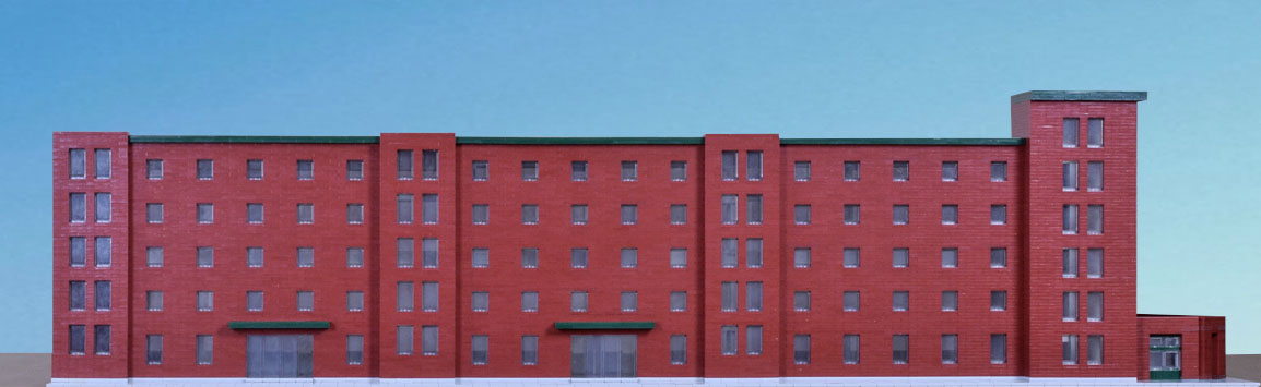
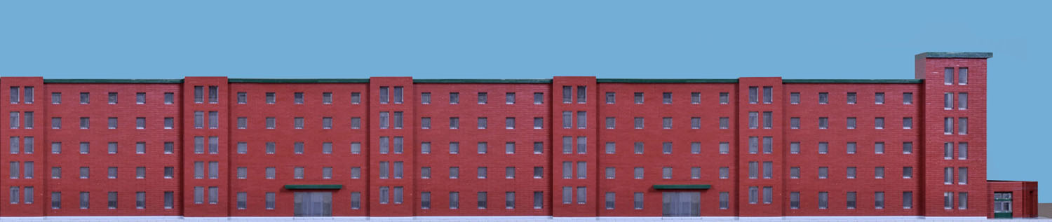
I’m trying to imagine walking up Vassar Street alongside the Metropolitan Storage Warehouse, the minute or so that would take. Ahead, the corner tower a story higher; above, elaborate cornice work, reaching out, lifting up, dividing in crenelation. Further on, circular windows, arches, and stars of decoration. Beyond the tower, the main campus of MIT.

But the tower is distant, the embellishments high or few and faint. What I am most aware of from the ground is the continuing mass of brick pierced by small windows, its texture, its endless division, its warm color—the fact of brick itself, its presence, dominant for well over 500 feet.

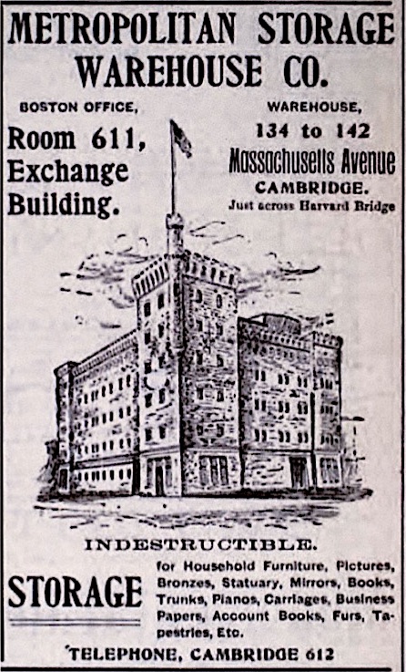
The sign, in large block letters, is matter of fact as well and directly to the point, yet taken from context has metaphorical suggestion. It conjures a collective urban memory, kept and stored, and assures us this memory is safe from fire, perhaps other calamity.
Then I think if I had made this walk daily, over years, a lifetime. My life would have been qualified in ways substantial but not easily defined. The warehouse is a bold, bald statement of function and mass scarcely qualified by style. Necessity has taken over, a priority has been set, others downplayed or put aside. It also is a reminder, a massive instance of the past, over a century ago, an example of perseverance, of endurance, which, because of its solid mass, looks as if it will last forever. Yet for all its directness, its simplicity, its obvious containment, or rather because of those, the warehouse seems unfinished, incomplete, the mass waiting to be transformed into something else, and it exists as a figure, stark and raw, of transformation in the abstract, its perpetual possibilities.
The warehouse was part of an investment scheme to develop a neighborhood in Cambridge by the Charles River, along the lines of Boston’s Back Bay. Construction of the first section, by architect Fred Pope, began in 1894. Peabody and Stearns oversaw construction of four more sections between 1896 and 1911.
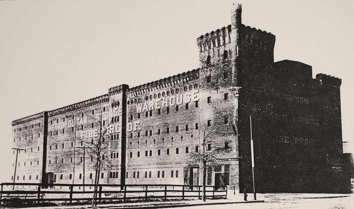
Designed like a fort, it was meant to impress with its solidity and security, as well as establish a stately command over the area and set the moral tone for the buildings to come. From it we get a sense of the era, its ambitions tempered by rough decorum and a probity that did not conflict with commercial gain. It’s where we were.
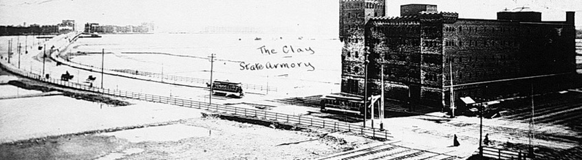
Development faltered, however, in part because of the Panic of 1893. By the end of the 19th century only two sections of the warehouse were built. The neighborhood didn’t take off until MIT relocated there in 1916 and the campus spread. Since then the warehouse remained intact and functional up until recent years, over 220,000 square feet, some 1,500 storage units crossed by sweeping corridors.
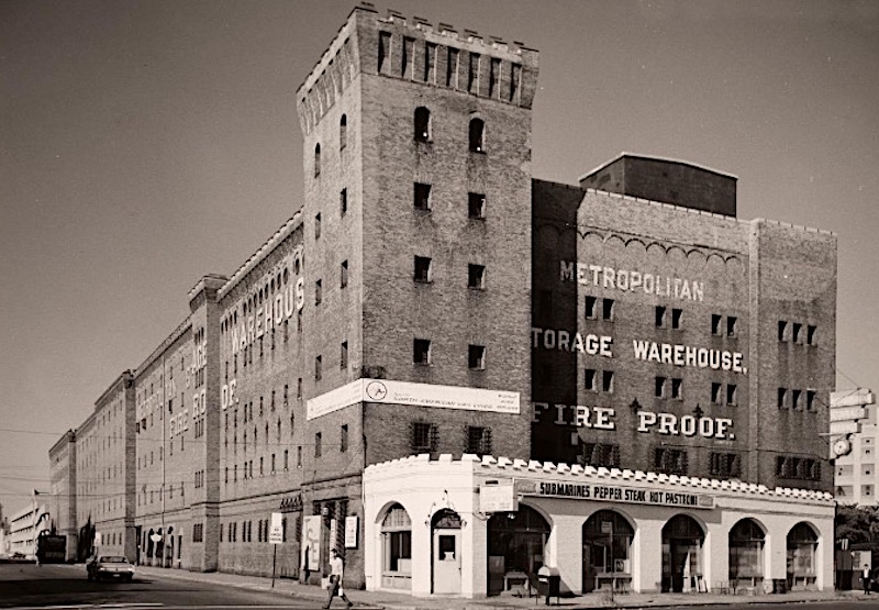
The one-story side building, angled to conform to diagonally crossing Massachusetts Avenue, was added in 1923. Sandwiches were once sold there, its sign, with its heated reference
SUBMARINES PEPPER STEAK HOT PASTRAMI
contrasting with the larger, cooler, ever emphatic
METROPOLITAN STORAGE WAREHOUSE
FIRE PROOF
heralding, maybe, a new age. And the warehouse is now entering another phase.
MIT’s adaptive reuse of the Metropolitan Warehouse building will redevelop it as a center of interdisciplinary design research and education and as a new home for the School of Architecture and Planning (SA+P). The building will also house a flagship makerspace, an independent and collaborative creative space envisioned by Project Manus as a substantial addition to the MIT Makersystem that will expand the design and fabrication facilities available to the campus. As a whole, the reimagined Met Warehouse will include new classrooms, design studio space that will significantly increase MIT’s capacity for arts and design programming, new faculty offices, and areas for meetings and collaborative activities.
from MIT/Capital Projects
Much of the warehouse will be kept and restored, preserving the overall character of the building as so many have known it for so long. In so many ways the project is apt for the creative efforts of an architecture department. It could also set an example of preservation and adaptation for creative and collaborative efforts elsewhere.
Our built environment has been greatly leveled and replaced with new construction that does not look back. We recreate ourselves, our beliefs, our appearances without anchor. The warehouse serves as a reminder that we do have a past and maintains continuity in a timeline we too easily forget. But time is a course with breaks and disruptions, and we are reminded of that as well. The warehouse is one kind of memory, and it stands as a protection of specific memories, of the fact of memory, in the abstract, of the process of memory itself.
It displays a definite style, and with the style reflects an attitude of another time, a launching point for today’s designers, though likely neither will be repeated. The virtues of its style, and it has them, cannot be revived in our current lives—they no longer fit—though can be referred to. More likely, it exhibits a stance against which to react. Its shortcomings, contradictions, and oddities—the building has these as well—give designers a sense of what to avoid. It does speak of empire. There is a cautionary tale here, as through its example we are reminded that our buildings, however fresh and vital we find them today, may well look just as disjointed and outdated in years to come. On a sober note, the building exists as a memento mori. So much of what the design once represented, once stood for, the validity of the design itself have simply passed. Sic transit—our time will come.
With style, the warehouse’s language and the language of that time, the implications of arches and cornices, of embellishment and elaboration, the extended statement of those into formal conception. Again a point of contrast for us today, but one that nonetheless points to the need for language, whose revisions still need to maintain communication within the elements of a structure and without, to the world, to us using, looking, passing by.
For all its projection, its pretense, the building is rough, having an ad hoc quality of parts tacked on without full integration. There is much that is not final or complete in its design, and it could have been structured in different ways, likely no more, no less convincing. That’s not a criticism. Many of our best known buildings are imperfect assemblages, a large part of what characterizes them and gives them value. Called into question is the validity and value of notions of perfection, of completion themselves. Venturi’s thoughts on complexity and contradiction, difficult wholes, come to mind. The warehouse could be a launching pad for designs that raise the same questions. Imperfection, incompletion, disparate parts have their own value, more in sync with our times.
But the Metropolitan Storage Warehouse cannot be dismissed by criticism or contained by any style or attitude or critical theory. In its size, its mass, its overwhelming statement of brick it exceeds all of those. For the same reason, it leaves open alternative statements, anything else that might be said about it, about anything else, and it won’t rest with those either. Functionally, as a warehouse, it is neutral and indifferent. It keeps whatever anyone wants to store.
For architecture students it provides a simple demonstration of the basics of structure, mass, and space writ large, constantly in view, palpably experienced throughout the course of their studies. With those, the demands and challenges of largeness, its ambitions. Everything is open, everything is left to explore, to figure out, and as such the warehouse liberates students to come up with their own ideas. It does not propose or impose, it invites.
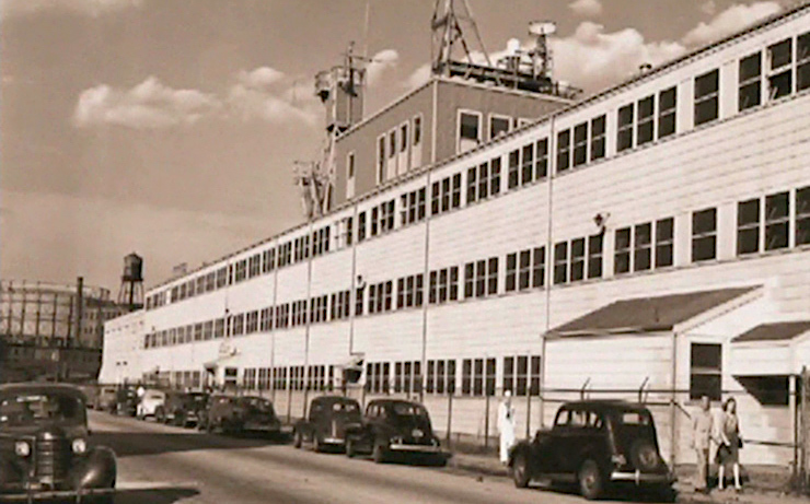
Stewart Brand, in his study “How Buildings Learn,” cites Building 20 as an example of a “Low Road” structure, a type of space that is unusually creative because it is so unwanted and underdesigned.
Jonah Lehrer, “Groupthink”
The Jazz Loft, New York, in the 50s and 60s, was once an example of such a structure. MIT’s own Building 20 provides another. It was built quickly and cheaply during WW II to house scientific and technical research needed for the war effort. There was no architectural integrity to offend. Its negligible design put focus on the users themselves, whatever they might think and create, opening the unlimited possibilities of the mind and collaboration. Its cheap construction made it readily adaptable.
As a result, scientists in Building 20 felt free to remake their rooms, customizing the structure to fit their needs. Walls were torn down without permission; equipment was stored in the courtyards and bolted to the roof.
Later it housed other groups.
By the nineteen-fifties, Building 20 was home to the Laboratory for Nuclear Science, the Linguistics Department, and the machine shop. There was a particle accelerator, the R.O.T.C., a piano repair facility, and a cell-culture lab.
The layout was erratic and constantly changed, forcing unanticipated confrontations. The groups, along with their diverse disciplines and interests, came together in its odd corners and the haphazard labyrinth of corridors, with unpredictable results.
Building 20 became a strange, chaotic domain, full of groups who had been thrown together by chance and who knew little about one another’s work. And yet, by the time it was finally demolished, in 1998, Building 20 had become a legend of innovation, widely regarded as one of the most creative spaces in the world.
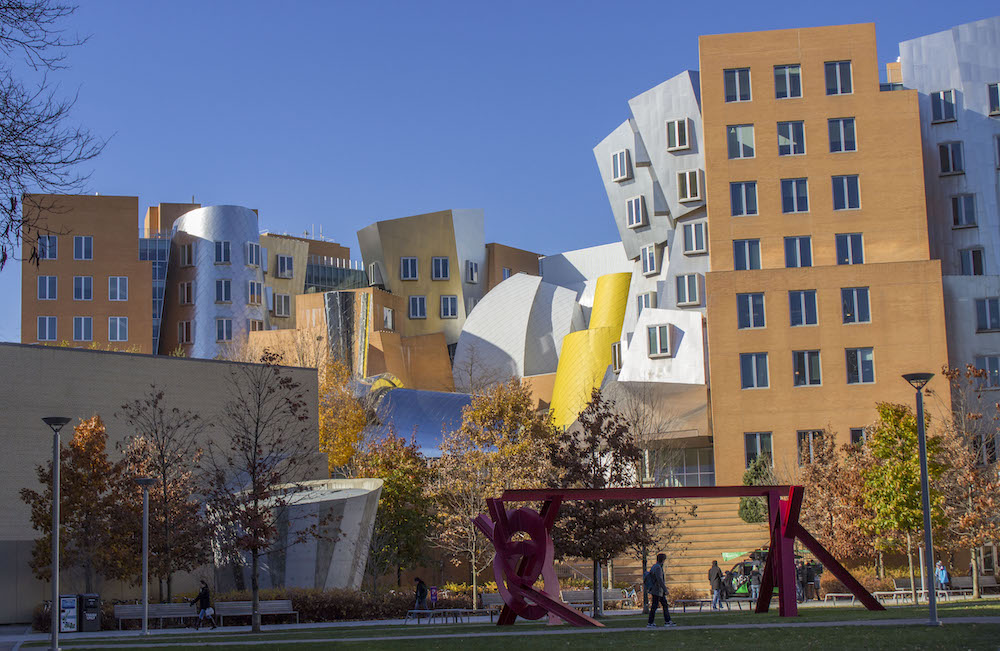
For comparison and contrast, consider Building 20’s replacement, the Ray and Maria Stata Center, Frank Gehry.
The Metropolitan Storage Warehouse is closer to middle than low road and was built to last, but otherwise it holds similar possibilities for contact, for exploration, for the creative act. It can accommodate a variety of spaces for different needs, for groups large to small. It can also have small, out of the way areas where the individual might escape the crowd, whatever has been decided as necessary, as current, and be alone with his or her own thoughts, whatever might be brewing inside, what might go against the grain. These spaces could constantly be readapted for whatever comes. Inside, its rough textures but solid walls invite use and can stand abuse, and they will show that wear like a cauldron that has been tempered and enhanced by many years of heat, or become palimpsests that reveal layer upon layer of traces of past efforts.

The significance of the sublime as a subject of art and architecture lies in its conceptual reach or its spiritual dimension. The sublime refers to immense ideas like space, time, death, and the divine.
Kate Nesbitt, “The Sublime and Modern Architecture”
The warehouse still implies more, in its size and vast, open spaces, but also in its contained darkness is a place for doubts, the unknown, the unknowable, a sense of the tragic, of ominous possibilities nature, the world held in the past and might yet unleash, those and still something else.
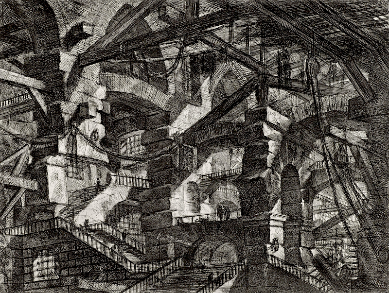
Because of its size, the temptation is to invoke Boullée, but the warehouse is solidly American, down to earth and sublimely pragmatic.
Creativity is a much abused word, currently meaning not much more than whatever we happen to come up with that is odd or different, at least to us, now, anyway. It needs not only precedent for guidelines, but also as something to react against. It requires exposure to different ideas, different times, to contradictions and failures as well as solutions. With those, always, fresh perception of the world, both past and present, of the self, of changing selves.
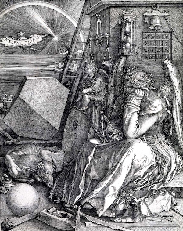
Hers is the inertia of a being which renounces what it could reach because it cannot reach for what it longs.
Erwin Panofsky, The Life and Art of Albrecht Dürer
Creativity also needs exposure to something else we’ll never capture or define but still should keep in mind, somehow. Yet it is the angel’s distance that fuels the creative urge. Sometimes our greatest inspirations initially brood in darkness. And sometimes insight and resolution can only come from chaos. The conditions for creativity cannot be planned or designed or made permanent. They can only come from the creators themselves, whatever they bring with them, whatever they grasp beyond.
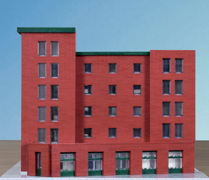
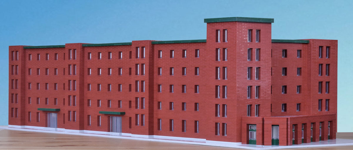
My model is both a tribute to the warehouse as well as an exercise in managing size. It is not meant as an improvement of the original design or a possible renovation. Obviously, however, I was influenced by its design and I intend it to be put to similar use as a creative space.
My windows are larger, too large to serve the purposes of storage, but large enough to provide adequate light inside while maintaining the integrity of the brick mass. I added dual entrances along the side partly to vary the design, but also because this would be a building with different parts requiring separate access.
I did opt for clarification and regularity in the design. And I chose modern simplification. I had the parts for crenelation but couldn’t bring myself to use them.
The three narrow, protruding vertical elements, evenly spaced, anticipate and lead up the tower, one/two/three. They might be used as stairwells, and the building would need several. The green planes at the doors and roofs provide division and accent, those over the door, offset for tension, repeating the line of the roof, pulling away from the tower.

For added tension and variety, the windows of the four vertical elements are taller and have a lower base than that of the windows of the building proper, giving the overall design a slight lift. But the dominant pattern is determined by the squarish windows set in regular patters in the squarish brick sections, what most defines the character of the building.
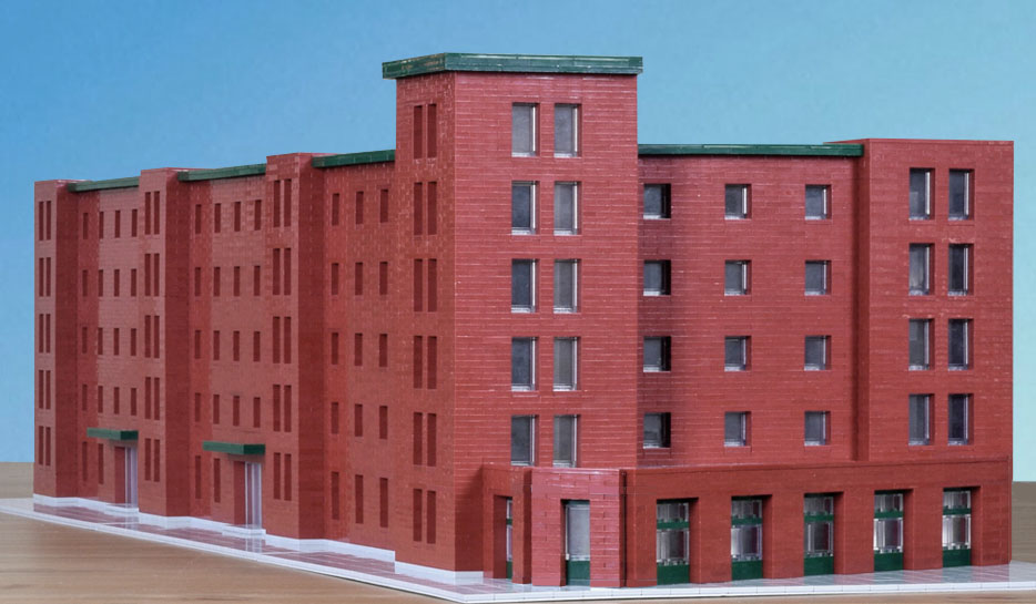
My building is much shorter, by some 200 feet. The above revision is closer to the actual length, which, if used, would require a design overhaul. Maintaining order and interest in a building this long is a challenge, and I’m not sure any solution doesn’t lead to compromise.
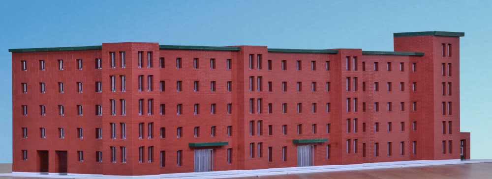
As in the original, I put openings in the side for protected delivery.
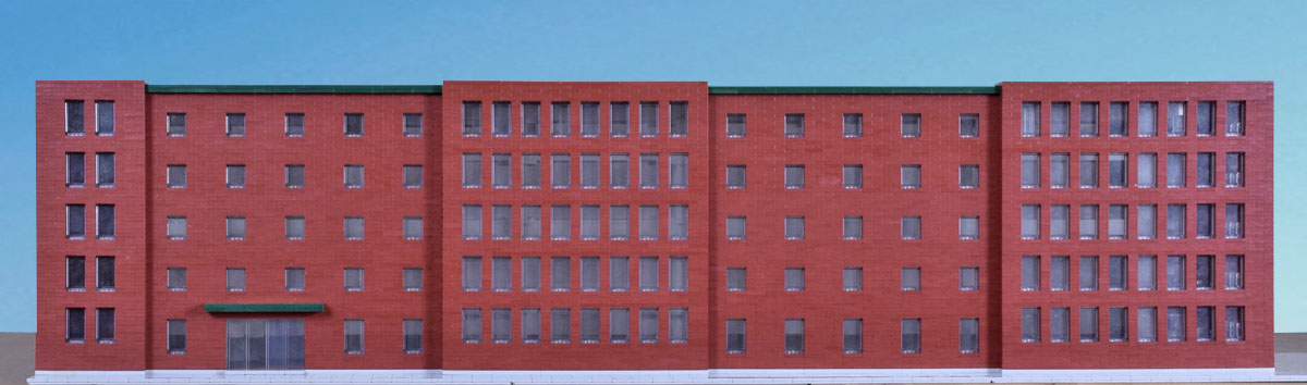
The main challenge in renovation and adaptation of the original is light. My solution is to add large areas of squares of sectioned glass on the rear, before interior space that could be configured in a number of ways, including large assembly rooms two or more floors high left open or closed with glass to allow light to reach other areas inside.

But I want to maintain the presence, the contrast of somber light. The rooms at the smaller windows could be used for faculty offices, seminars, small impromptus gatherings, or just remote places to get away.

There is no defense stylistically or functionally, in my model or the original warehouse, for the odd side addition. Yet it is impossible to imagine either without it. It provides an extreme contrast with the mass, partly offsetting it, bringing the building back to the sidewalks and street, their traffic, and down to human scale. I plan to keep serving pepper steak sandwiches.
.
Resources
MET X is Ensemble Studio’s proposal for renovation, which solves the problem of light and ventilation with atriums that reach deep within the interior of the building. Discussion, full plans, diagrams, and renderings can be found here. Any renovation will involve substantial structural changes, which I didn’t consider in my model. Possible structure is discussed and illustrated as well.
Diller Scofidio + Renfro, with Leers Weinzapfel Associates, have been given the contract and preparations for adaptation are underway. This PDF contains full plans, drawings, and renderings of their proposal, along with illustrations of site and the original. The program is quite complex, and it is mapped out in the floor plans.
.
Sources
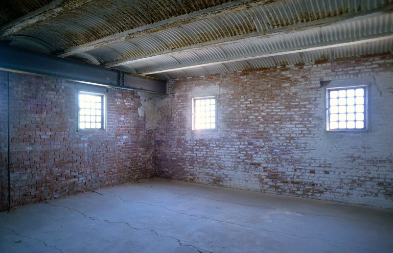
Interior photographs of the room and corridor by photographer Cynthia Abatt. Other photographs of the interior of the warehouse and her other work can be found at her site.
The warehouse ad and historical black and white photographs, along with most of my historical information, from the Cambridge Historical Association. More pictures, information, and history can be found there. This is a good read.
First color photograph of the warehouse by Jose Mandojana from Spectrum/MIT.
Building 20 photograph from MIT’s Building 20: “The Magical Incubator,” InfiniteMIT, 1998.
Ray and Maria Stata Center photograph by Lucy Li, Wikimedia Commons.
Jonah Lehrer, “Groupthink,” The New Yorker, January 22, 2012.
Kate Nesbitt, “The Sublime and Modern Architecture: Unmasking (an Aesthetic of) Abstraction,” 83rd ACSA Annual Meeting, 1995.
Piranesi, Carceri Series, Plate XIV from Wikimedia Commons.
Albrecht Dürer, Melencolia I. I have written about it here.
.
.