Another tribute to the Metropolitan Storage Warehouse in Cambridge, discussed in the previous post. Again, my interest is not to suggest a possible renovation or provide an alternative, but rather to experiment with its basic forms and work within an approximation of its site and program. And once more it is designed to provide a home to public or creative efforts—say an architecture department. I wanted a basic building that has some interest but, like the warehouse, appears rough and incomplete, that might invite completion, exploration, or reaction—as I argue for the warehouse in that post—and that doesn’t try to upstage or direct the work inside.

There is no substitute for the real thing. Age, wear, the historical style, the odd embellishments, the imperfections, the rough mass of the original—these cannot be reproduced in a model or an actual construction. Ensamble proposed a renovation that respects the integrity of the exterior of the original building while adapting the interior for the needs of the MIT SA+P. Their proposal can be found here.
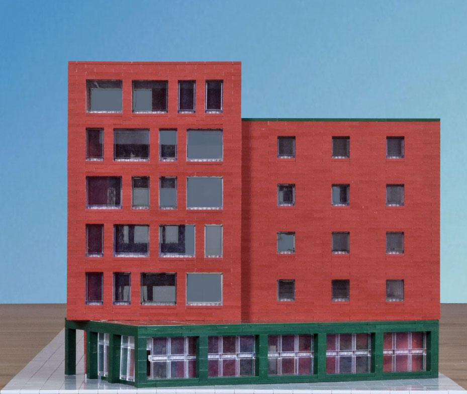
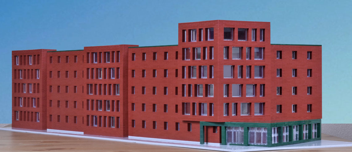
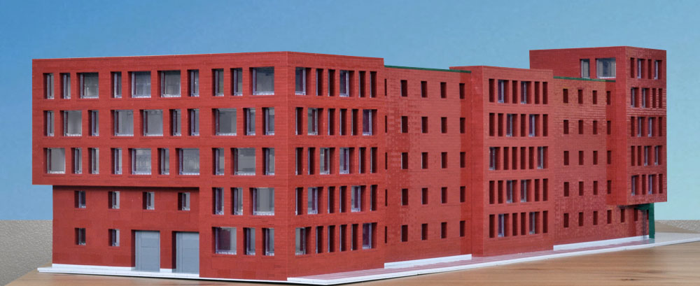
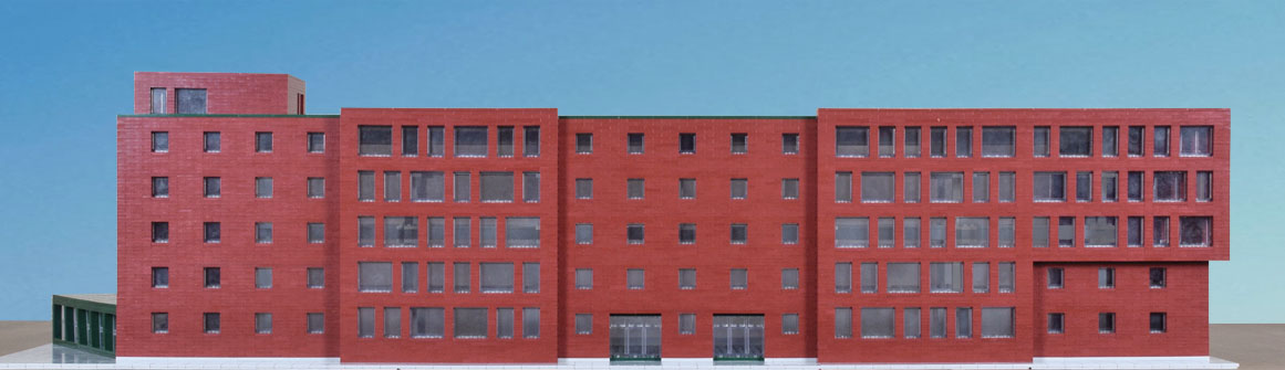
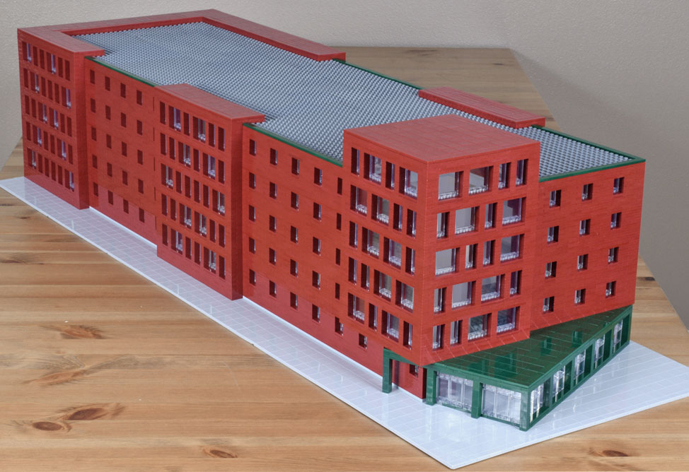
I kept the side building in abstract form, accented in green. It provides one entrance at the corner intersection and might serve as a lobby and exhibition space. The tower is larger, really no longer a tower, and likely more serviceable.
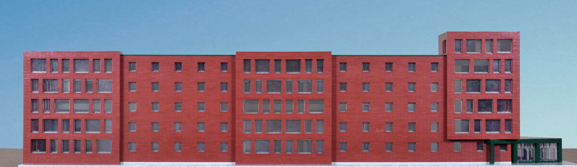
This “tower” is raised a floor to sit upon the side building, whose elements extend into the sidewalk, providing accent and focus—and disruption—along with direction towards the corner. But this facade is largely a formal face, closed to and protected from traffic on the street. There is a progression of the three major elements with greater glazing, one, two, and up, to relieve horizontal monotony. At about 300 by 90 feet, as in my previous effort, this version is about 200 feet shorter than the original.

Behind these elements, a basic grid, regular, with smaller windows, that retains the building’s major aspect, its mass.

By contrast, the frontal sections have near random patterns. Movement towards the corner is arrested by these, and they call for rearrangement or resolution. One pauses at each with questions.
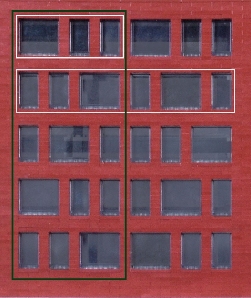
Each of the larger frontal sections is divided in half. Within each half, at each floor, units of two narrow windows and one twice as wide, elements A and B, as if terms of some binary code. The only rule I followed is that each unit not be repeated from one floor to the next and that the combined two units not be repeated in the five floors of the entire section. The fourth floor, for example, follows the pattern A-A-B/A-B-A. The narrower frontal sections, at the side and tower, make adjustments to those rules. I’m sure I’ve added structural issues with the staggered posts.
The sixth floor, at the tower, presents a challenge. A spiral staircase on the fifth floor could provide access or the fifth and sixth floor might be combined to provide a room, about 40×40 feet, with a double-height ceiling—a special space for elevated activity.
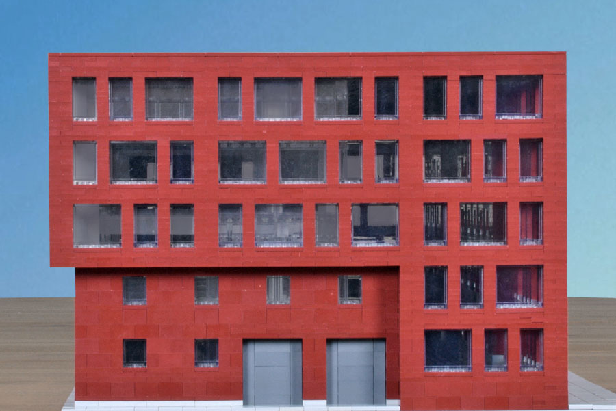
As in the original, there is a service entrance on the side.
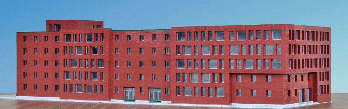
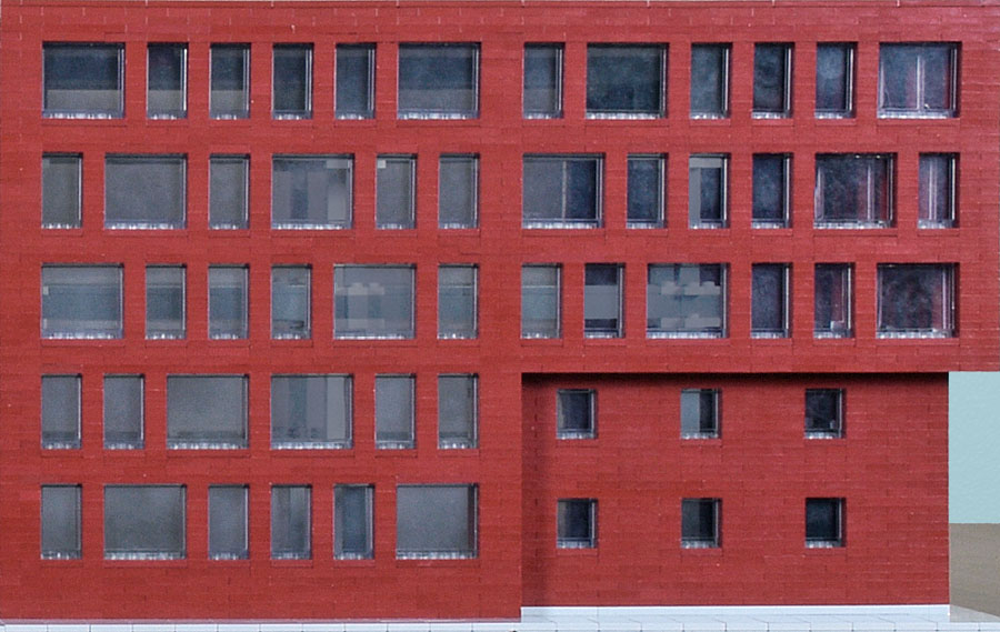
The rear facade presents a more active face with the overhang on the right.
And this side would serve as a main entrance since it opens out into the campus, away from traffic, quieter and more accessible on foot.
It could have a narrow plaza of sorts along with landscaping.

The main challenge to renovation of the original comes from providing the interior more light and ventilation. Ensamble does this through the addition of light wells that extend to the first floor. Their page gives drawings, models, and full plans


along with several renderings.
Influenced by Ensamble, I do something similar, though haven’t modeled the wells or interior.
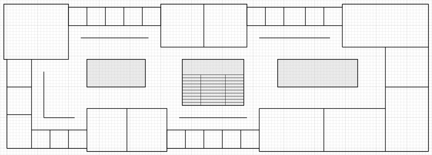
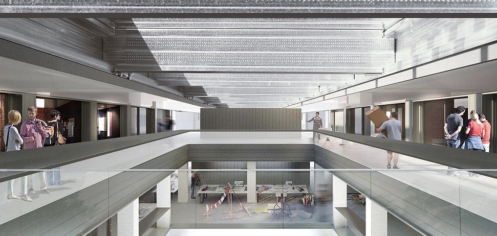
Above, a rough plan for one of the upper floors. The light gray rectangles represent the light wells, with the center one holding the main stairs. The offices, about 12×12, are separated by corridor walls for privacy as well as to add darker areas to the building, preserving for contrast the somber light of the original warehouse. The other areas would be for classrooms and studios and could have partially transparent walls to pass light to the interior. Some could be extended two floors for higher ceilings. The open area would show the grid structure throughout, not pictured in my plan, promoting the idea of open structure to be contemplated and completed. There is room for seating and gathering in some areas as well as exhibition space and information boards.
There are many other possibilities, depending on program. One floor might be devoted to smaller rooms, offices and conference and seminar space. The first floor could be left essentially open, with seating and amenities, for general public gathering.
Of course the building will be fireproof.
.A casual virtual thought
As part of the design community’s incorporation of talent into the nascent, ever-growing world of blockchain technology and digital architecture, more spaces are cropping up that have the potential to do outsized business opportunities with ramifications in the metaverse and beyond.
One of those spaces is the relatively new Decentraland, a 22-month-old 3D platform that currently plays host to over 90,000 parcels of land subdivided into individual 9-square-mile plots which can command prices as high as $2.43 million as the cost of digital land has boomed in unison with the rise of NFTs.
Josh Niland, Archinect
The model, presented on its own web site, could have a virtual use that might, in fact, have some virtue. It could serve as a symbolic representation of a creative center, providing virtual offices, studios, and exhibition and performance space for like-minded artists and writers across the globe.
There would be no charge.
.
Notes
Drawing, floor plan, and rendering of MET X. MIT Campus from Ensamble Studio.
Photograph of the warehouse by Jose Mandojana from Spectrum/MIT.