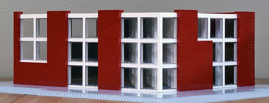
This is a variation on the two versions of a possible replacement for the Central Hotel in the St. Johns neighborhood of Portland, reviewed in my earlier entry Centering a Town: St. Johns/First Efforts. That post sets the location, has rough floor plans and program, and explains the concepts behind the design. Above, the front corner view, at Philadelphia and Lombard, looking out on the plaza. In this version the grid is more exposed and fully exposed at the corner, distinguishing its intersection there as a corner, announcing its openness and signaling entry. Also see Site: St. Johns, Portland for maps and pictures of the area.

As in the previous versions, I’m limited by what scale, 1/60, and the plastic pieces allow me to do. Proportions need fine tuning and the elements of the grid should be thinner. And again, they could be painted the color of the St. Johns Bridge or made of timber, unpainted to show the colors of the wood.
Side view, along Philadelphia. As I say in my first entry, a cube/grid can have symbolic associations of building in the abstract, of stability and containment. It provides a structure, albeit an abstract one, to complement the suspension structure of the St. Johns Bridge. The building should express openness and say use me. A grid suggests continuity but also can lead to monotony. I vary the grid with asymmetric brick sections. Each side is different. But the grid provides overall control and defines proportions.
I continued the grid inside the model as an exercise and to keep it square. It could be continued inside in the open areas, as in the other versions. Without specific references of details, such as people or doors or windows, it is difficult to get a sense of scale from this model. Something similar might happen if it were actually built, which is intriguing and/or problematic: it forces continual adjustment before it and in relation to the buildings that surround.

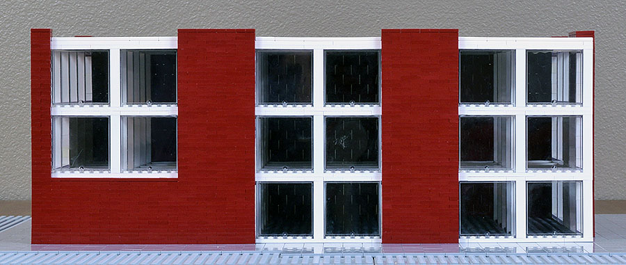
Front view, facing Lombard.
C&P Corporate Headquarters in Graz, Austria, by INNOCAD, has a similar grid to contain the entire building.

Photo via e-architect, by Paul Ott. The areas closest to the sides, at the perimeter, are open, allowing passageway and gathering places around each floor. I like this and wish I had room to try it. Also retractable screens control sunlight on each square and give the sides varying looks.

Rear corner. This building could have the same layout as the previous two, or it could close the open space at the front and add more classrooms on the second and third floors. Here I moved the black box theater to the back.

Since the theater doesn’t have windows, this placement takes advantage of the common wall with the building next door and the need to block the view from the back half of the rear.

The rear corner would have a broad view of the police station and bridge across the street as well as of a small corner of the plaza, which could be further landscaped.

Rear view.

About This Project
I’m experimenting, obviously, and trying to learn something about architecture. I think it would make an excellent project for students. The building is small and manageable yet, as I argue in my first post, could have significant impact esthetically and socially on the neighborhood. The challenge is to design a building that both fits in with the locale yet also distinguishes itself, both in its function and as a symbolic marker. My designs pull away from the former in their abstractness.
It is also a project that could be handled by a small firm. The most important architecture comes not from the better known architects of our time—the “stars”—and their huge firms, but from the lesser known local figures, simply because they create the buildings most of us see and use most of our lives.
Other Designs
Other designs for this project, along with background material and more photographs of site, can be found here and at these posts.