Dhaka International University Administrative Building

“RED” symbolizes strength in our culture

from the architects’ statement

I keep returning to this building, my model on a table, approaching it, imagining entry and exploration of its floors, standing back in contemplation. It’s a modest building, about 68 x 52 and 50 feet tall, four stories if the roof area is included, a fairly simple structure with some complexity yet is solid, elemental, monumental even, but not imposing, direct in expression but open with suggestion. Something important is supposed to happen here that won’t have quick rules or rote answers. The structure rises in relationship to its culture, its environment; it stands apart. In the context of the turmoil the last years, of all time, it raises questions about what can be asserted, what needs to be challenged, what is ephemeral, what might endure. For Bangladesh, specifically, it projects hope.

Continue reading

Ilya Golosov: Zuev Workers’ Club/Moscow

Giuseppe Terragni’s Casa del Fascio, Como, Italy, has been disassembled to build Ilya Golosov’s Zuev Workers’ Club, Moscow. I can’t decide how much contradiction, even irony, there is in that. Both were built about the same time, early 1930s, late 1920s, a period of intense modernist innovation and debate in which both architects were involved. Both buildings followed and were responses to massive turmoil and social change. Both housed functions meant to serve a broad population, these uses based on political ideology, those ideas hotly debated as well. Most, both are original, striking, and memorable designs, what first drew me to them.

My main interest in both, however, is what we might learn from them and adopt for our current world. The larger our cities grow, the more we spread out, the more we become isolated and culturally diffuse. How can we maintain our common identity and keep our neighborhoods vital? Part of the answer lies in our institutions and the architecture that houses them. My own virtual project suggests a possible solution, explained generally in Centering a Town: St. Johns/First Efforts, with more thoughts and designs here. A modest building, designed well, could do much to serve a neighborhood and visually enhance and anchor it.

Terragni, however, was a Rationalist and Golosov’s Zuev is considered Constructivist—there is much to untangle here that I will put aside.

And both, of course, had in sight different political ideologies.

The club in 1929. The passersby give a sense of a past still present, of the transition the Soviets had to make.

Continue reading

Centering a Town: 23rd. Effort/Homage to Mies (1/72 scale)

In the metopes below, eternal adversaries grappled in inextricable pairs: Lapiths and Centaurs, Greeks and Amazons, Greeks and Trojans along the north side in the direction of Troy, Giants and gods on the south. In many of the metopes the struggle was shown in mid-course: there was no victor, no vanquished. Warring opposites complemented each other in intricate, almost heraldic, groupings—and this is perhaps another essential aspect of the term Classical. It conjures aloofness, a sense of timeless idealism; but involvement, too, and violent involvement at that, is part of the Classical spirit.

Spiro Kostof, A History of Architecture

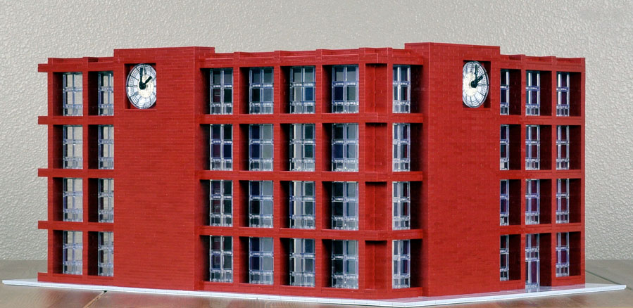
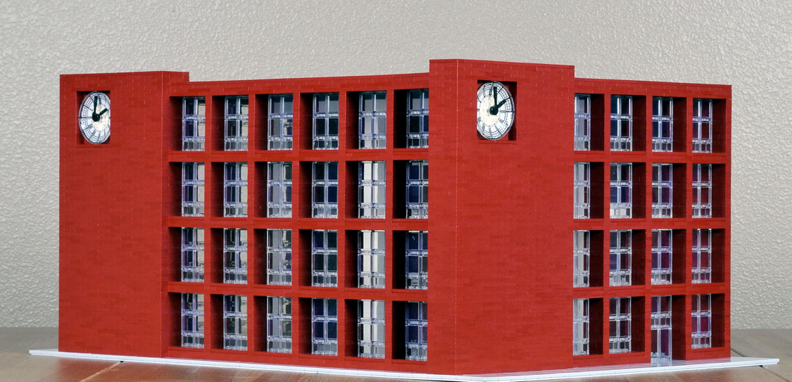
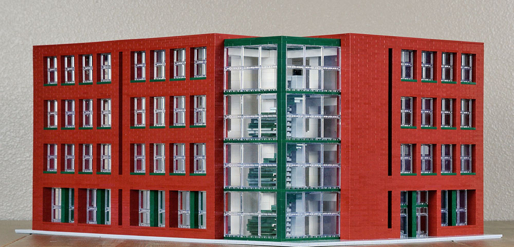
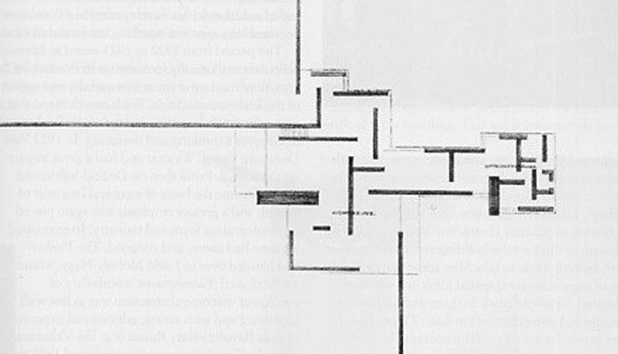
The drawings of Mies van der Rohe’s Brick Country House are nearly a century old. Reference to it in my “modern” design means that I’m following a tradition well in the past. His project implies that design, like life, is an active process, that the goal of architecture is to capture that understanding. It is Classical in the sense that we are aware of careful and thoughtful proportions, but also of proportions carefully shifted. And the design is Classical in the sense Kostof suggests, of competing stresses, contained but kept vital. Above, a metope from the Parthenon.

It is the challenge of contemporary architecture now, how to maintain yet enliven the modern tradition—it’s what we have—yet break away from the sterility of glass boxes and too well ordered grids. Too many solutions just push the box or attack it, without esthetic grounding, cultural context, or solid frame of reference, too often to excess. Mies’s design is reserved yet still fresh.

Continue reading

Centering a Town: 23rd. Effort/Homage to Mies van der Rohe’s Brick Country House

I first saw the drawings of Mies van der Rohe’s Brick Country House over forty years ago while in college, in H. H. Arnason’s History of Modern Art, a standard text on the subject at the time, the pictures illumined with only a few sentences of explication. First the three-dimensional drawing of a home spare yet engaged, complex yet composed, low lying yet forward looking—a lean, solid wedge opening out into the world and negotiating the earth and sky:

Below it the sketch of the ground floor plan, a grid of right angles that do not intersect, difficult to read as a living space, that extends, in seeming contradiction to the first drawing, out into space without clear containment, yet still a scheme coherent and compelling:

And a chord was struck within, or a tone cluster, that gathered and realigned.

From my essay “Completing the Mies van der Rohe Brick Country House, An Odyssey.” This effort pays one more homage to the house. The one thing I am certain of is that it is not the way Mies would have designed the building, had he taken on the project.

Continue reading

Centering a Town: 22nd. Effort/Under Construction

Structured, orderly, regular, and, but for the corners, symmetrical. The building explains itself in a few terms quickly grasped. The theme is Under Construction because the building retains the scaffolding that presumably was used in stages of its construction.

Although really their use is contained and their placement carefully planned. They are integrated into a completed structure and obviously intended to be permanent. Another possibility is a design that more resembles a building frozen in the process of its construction, incomplete and fragmented, that challenges itself, asks for completion or demolition—a temptation, though I don’t know if that could be done without invoking postmodern slapstick and irony.

The scaffolding pieces add decorum, and, in their openness, involvement, and tensions, provide a modern substitute for columns. The building has the look, in fact, of a Greek temple. The columns give energy to an otherwise static design, as well as add a note of modernness and technology. And since they support the ledges above the second floor and the roof and strengthen the largely glass walls, they are functional, not decorative. This is a building that speaks function, though that function is exaggerated, and with modern materials and techniques they aren’t needed.

Continue reading

Centering a Town: 21st. Effort/Acceleration

Art, and above all, music has a fundamental function, which is to catalyze the sublimation that it can bring about through all means of expression.

Xenakis

I often listen to Xenakis’s music for percussion when I design and build. Its staccato insistence and limited tonal range are appropriate for construction, which develops by extended repetition without the contrasts of tonal color or the arc of drama. Yet it has its own surprises. The music is a distraction, a diversion from silence, where I can’t think what to do next, but also a call for patterns and yet at the same time a break away from standard patterning. It encourages me to open up, think of other things, to think beyond set ways of thinking, beyond what I think I know.

xmusic

The percussive variations approach randomness without falling into chaos or noise, which themselves have their own possibilities. If nothing else, it pushes me to keep going without worrying about what I’m doing or where I’m headed. Listening provides a way to persist when there seems no direct course, nothing at all to do. I would like activities in the building to follow a similar course.

And a building can suggest sound, even music, even thought.

Xenakis designed the windows for Le Corbusier’s Tourette monastery, based on theories of mathematics and avant-garde music.

In order to avoid a monotonous repetition of standard elements in the immense façade of the building, Le Corbusier asked Xenakis to develop a principle for windows that he had caught sight of during the Chandigarh construction. . . . The resulting window configurations are very vivid. Xenakis developed the dimensions of the glass panels according to the blue and red series of the Modulor. Thanks to the resulting effect of dilatation and contraction, the façade seems to become a dynamic membrane. The principle finds its most virtuoso application in the Tourette monastery, a project that Xenakis worked on as of 1954, with the western façade conceived as a great architectural counterpoint.

From the Xenakis site, along with the drawing.

Photograph by Fernando Schapo, from dezeen.

Continue reading

Centering a Town: 20th. Effort/Push-Pull

A single brick, in itself, by itself, brings associations:

A brick is an obdurate object of ambiguity that hovers between idea and matter, between life and death. Its texture can be smoothed to glide our touch or left rough and abrade. It can be molded into even shapes for consistent construction or made uneven, presenting individual challenges each time one is laid in a course. The hues can be made consistent, offering an even appearance, or they can vary from one brick to another, presenting more individual challenges. But while it can come close to an ideal oblong shape, it never attains perfection, and it can as much be said that it approaches perfection as it resists it. A brick has the right heft for throwing through a window in revolt. It can also be stacked to encase one solidly. Its color takes on that of blood and the earth from which it is made, or both inseparably combined. Whether it preserves blood or shows it spilled, whether it reveals decay or stalls it—these questions cannot be answered. In spite of its ambiguity, however, we are always aware, in mind and in hand, of its touch, of its mass and weight, of its presence.

From my essay Completing the Mies van der Rohe Brick Country House, An Odyssey.

Continue reading

Centering a Town: 19th. Effort/Planes & Boxes

My first interest in this design was to find a way to break up the shoebox such a building inevitably becomes. To do this, I used separate planes and boxes at different heights that remain individual and slightly overlap or extend from the building, that come together in varying compositions. This building challenges the notion of a building and highlights the activity inside. Like the classes, it is a place of analysis, of breaking into parts and assemblage. De Stijl, very loosely, may have been an influence, of which there really aren’t many examples in architecture.

Rietveld’s Schröder House.

Continue reading

Centering a Town: 18th. Effort/Compression

Concrete, brick, glass, and steel—it is a design of contrasts with an industrial cast that encourages use and production. Detailing on the windows would give the building a degree of refinement on the upper brick floors with the classrooms, above the ground levels of functional parts, highlighting their significance. The theme is compression because of the way discrete elements rest on one another and interact.

Continue reading

Centering a Town: 17th. Effort/Time II, IIa

Two more versions on the theme of time. A clock can do so much to call attention to a building and have it command public space, as well as lend it significance and suggest meanings.

I like the ideas in the previous version but its design is rough and needs work—I haven’t decided how yet. These present orderly buildings, closer to our common connotations of time. The risk is regimentation, which I try to offset with accents, the standing mass of the clocked brick columns, some asymmetry, and the deep, expressive indentation of the windows.

This indentation presents a challenge at the corners. That space can be filled in with columns or the intersection could be an open “L.” Or the horizontal beams can be extended at each level, creating a figure of intersection, as I have done in the first version.

Or the brick columns can be moved to the corners and cover that space.

Continue reading