
I first saw the drawings of Mies van der Rohe’s Brick Country House over forty years ago while in college, in H. H. Arnason’s History of Modern Art, a standard text on the subject at the time, the pictures illumined with only a few sentences of explication. First the three-dimensional drawing of a home spare yet engaged, complex yet composed, low lying yet forward looking—a lean, solid wedge opening out into the world and negotiating the earth and sky:

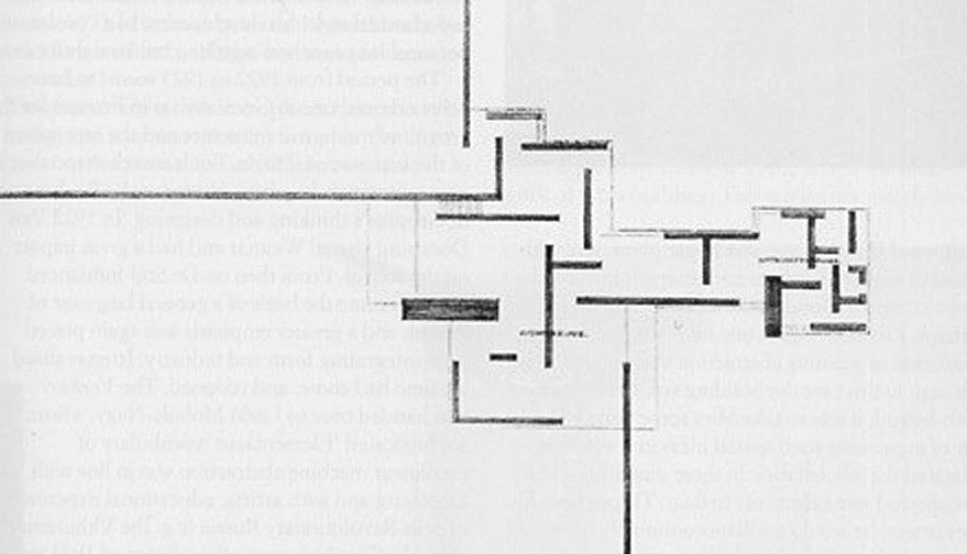
Below it the sketch of the ground floor plan, a grid of right angles that do not intersect, difficult to read as a living space, that extends, in seeming contradiction to the first drawing, out into space without clear containment, yet still a scheme coherent and compelling:
And a chord was struck within, or a tone cluster, that gathered and realigned.
From my essay “Completing the Mies van der Rohe Brick Country House, An Odyssey.” This effort pays one more homage to the house. The one thing I am certain of is that it is not the way Mies would have designed the building, had he taken on the project.
The house breaks down structure into separate and independent elements, glass and brick planes, that are combined in different ways. The walls, obviously, would be load bearing.
The floor plan suggests a schema of activity that could be varied and continued indefinitely, to infinity, as the lines of the walls extending to the ends of the drawing imply.
The plan gives a picture of a mind asserting itself, opening up to and grasping all space and time. It recalls the Cartesian grid with the implied cross suggesting the presence of x crossing y, giving us the coordinates to map the universe and comprehend it. But Mies’s grid, with the axes offset, the shapes incomplete yet suggesting closure, their interrelationship complex, gives us a picture of a universe that is active, not static, not divided evenly down a middle.
Again from my essay. An obvious contrast would the central floor plan of Palladio’s Villa Rotunda, a graphic representation of symmetry and poise, a picture of construction in an balanced and orderly universe.
![]()
Architecture is the will of the age conceived in spatial terms
Living. Changing. New.
Mies van der Rohe/“Working Theses”/1923
We live in different times and conceive of the universe in different terms. Mies envisioned the house almost a century ago, and what strikes me now is how fresh and vital the design is. That it might still be relevant is an assertion that is problematic. Relevance is up for grabs now.

I made a model of the house, found in my essay and here. I ran into problems and have no confidence in my construction nor am satisfied with it. The house was never built or modeled, and the sketch and drawing, created only for exhibition, do not wholly correspond. Also the three-dimensional sketch of the house is rough and difficult to read. Really, I feel the project is most successful as a concept, abstractly conceived, quickly rendered, and quickly grasped, the active grid beneath the thin line of the house in the sketch, seen from a distance, situated beneath the vast space it bisects, where we are invited to extend ourselves and fill in possibilities. Actual construction, I fear, would have disappointed, or at least fallen short of the designs’ suggestive power.

Rear view. Program is similar to that of other designs, with communal activities on the open first two floors and four classrooms on the third and fourth floors. The area on the left is for service.

The first two floors. About 72 x 96 feet for the building proper, scale of model about 1/144—make adjustments for detail. This floor could have an open and dynamic arrangement of walls that would designate different uses, and the rear part could be divided into two floors left open to the rest of the communal area. More structural elements will be needed, of course, in fact an open structure of beams and posts might become another feature of the first floors.

And that open lattice could extend up with the stairs through the third and fourth floors that hold the classrooms, these offset and arrayed slightly in a pinwheel arrangement. Above, a plan for the third and fourth floors.
This design keeps the brick and glass planes of the Brick Country House, but it is a four-story building in a limited urban space and has a full program. The axes are just slightly offset and the design only picks up notes of Mies’s design without exploring it fully or extending its possibilities. As I say, it is a homage. Still, symmetry and standard expectations are shifted.

Rear corner. The green represents planting of some sort. The glass corners have a view of it and the bridge and river.

Side view. The lower wall on the left pays tribute to the long walls of Mies’s house, really its most distinctive—and impractical—feature.

Front corner. Mies’s long walls, however, become narrow, vertical shafts on the side and front that don’t suggest extension. They do, however, help accent the plaza and give the building presence.
Front, main entry. A formal pose is struck.

I like the compositions, especially from the side views. It occurred to me while constructing that the building could be designed in any number of different ways, equally satisfactory, and I see that as its defining character. Final design is not absolute, just a suggestion, one of many possibilities. Gathering and learning are always open to questions and change.

A less satisfactory view. I can’t decide if this is a problem.
Wolf Tegethoff’s Mies van der Rohe: The Villas and Country Houses (MIT Press) is the source to read, which has a thorough chapter on the Brick Country House.
Background and Previous Designs
Other designs for this project, along with background material and more photographs of site, can be found here and at these posts.

A larger scale model can be found here.