Dhaka International University Administrative Building

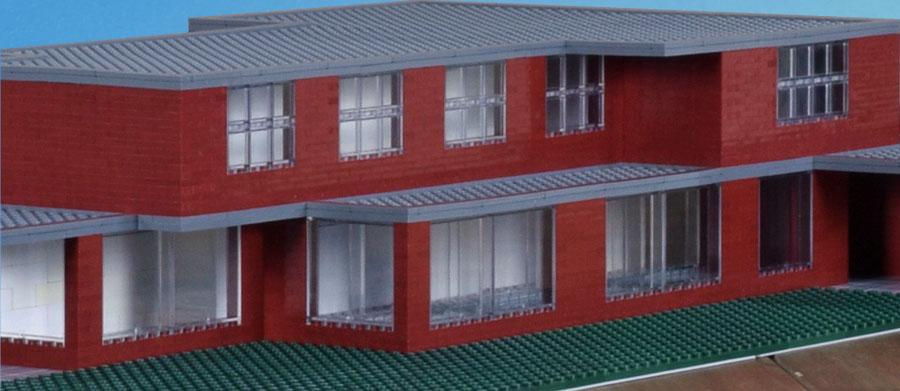
“RED” symbolizes strength in our culture

from the architects’ statement

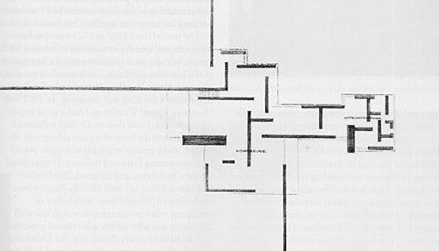
I keep returning to this building, my model on a table, approaching it, imagining entry and exploration of its floors, standing back in contemplation. It’s a modest building, about 68 x 52 and 50 feet tall, four stories if the roof area is included, a fairly simple structure with some complexity yet is solid, elemental, monumental even, but not imposing, direct in expression but open with suggestion. Something important is supposed to happen here that won’t have quick rules or rote answers. The structure rises in relationship to its culture, its environment; it stands apart. In the context of the turmoil the last years, of all time, it raises questions about what can be asserted, what needs to be challenged, what is ephemeral, what might endure. For Bangladesh, specifically, it projects hope.

Continue reading

Ilya Golosov: Zuev Workers’ Club/Moscow

Giuseppe Terragni’s Casa del Fascio, Como, Italy, has been disassembled to build Ilya Golosov’s Zuev Workers’ Club, Moscow. I can’t decide how much contradiction, even irony, there is in that. Both were built about the same time, early 1930s, late 1920s, a period of intense modernist innovation and debate in which both architects were involved. Both buildings followed and were responses to massive turmoil and social change. Both housed functions meant to serve a broad population, these uses based on political ideology, those ideas hotly debated as well. Most, both are original, striking, and memorable designs, what first drew me to them.

My main interest in both, however, is what we might learn from them and adopt for our current world. The larger our cities grow, the more we spread out, the more we become isolated and culturally diffuse. How can we maintain our common identity and keep our neighborhoods vital? Part of the answer lies in our institutions and the architecture that houses them. My own virtual project suggests a possible solution, explained generally in Centering a Town: St. Johns/First Efforts, with more thoughts and designs here. A modest building, designed well, could do much to serve a neighborhood and visually enhance and anchor it.

Terragni, however, was a Rationalist and Golosov’s Zuev is considered Constructivist—there is much to untangle here that I will put aside.

And both, of course, had in sight different political ideologies.

The club in 1929. The passersby give a sense of a past still present, of the transition the Soviets had to make.

Continue reading

Giuseppe Terragni: Casa del—

Under socialism much of “primitive” democracy will inevitably be revived, since, for the first time in the history of civilized society, the mass of population will rise to taking an independent part, not only in voting and elections, but also in the everyday administration of the state. Under socialism all will govern in turn and will soon become accustomed to no one governing.

Lenin

If we had seen this government center with that picture some ninety years ago, we would have, by association, formed one interpretation of it, a more favorable one for some of us, a lesser one for others. We might have said that architecturally it expresses how the monolithic mass of the state has been broken down into individual parts, these on a human scale, the independent parts brought together into coherent interdependence where everyone belongs in a structure that is open, light, and transparent. Walls have come down.

Terragni, in fact, says something similar in his interpretation of his building: “no barrier, no obstacle, between the political _______ and the people.”

But Lenin was not the picture we got on the wall.

Continue reading

Museum (two)

Another corner art museum in an urban setting, similar to the five-story version of my first effort in program and size—about 110 x 110 feet, 80 feet high. See that post for description. Again, the interest is in creating a building that distinguishes itself and announces its function at a busy intersection. The L arrangement of windows breaks the cube and relieves the sides, as well as points to and highlights the corner, announced by a massive column. On the top floor, a canopy overhangs an open area for views, for air, for a break from exhibition, which could be used for outdoor sculpture and plantings.

The design was heavily influenced by David Adjaye’s Dirty House in London, a warehouse converted to studio and living space.

The flat black color, among other things, brings together the different textures of the former warehouse and unites them in a rough, expressive geometric shape punched with square holes, above which, in absolute contrast, hovers a pure white plane, a modernist benediction. Combined, the two forms make a stark and compelling image, wholly coherent.

Continue reading

Mies van der Rohe/Haus Esters, early version, early vision; John Coltrane/Chasin’ the Trane

I wanted to make this house much more in glass. . . .

Mies is referring to Haus Lange, the companion villa at Krefeld, but the wish applies as much to Haus Esters, as evidenced in his early drawings. A photograph shows him working on pastel sketches of the garden and street facades, making final touches, maybe. My previous post has a model of the house as built, where you’ll find photographs for comparison, and I had it in mind while constructing this version.

Both pastels intrigue me no end, and I wanted to come to terms with them in this model. But I could only make rough guesses about placement and dimensions, and completing it was a matter of making uncertain choices, following them up, and finally stopping because I had no confidence alternatives would result in anything more correct or more convincing. There may be a point in that.

The garden face. Note the layout of the garden, an integral part of the design, raised, as in the version built. Time has taken its toll, but the drawing must have been faint in conception, in its realization, the image almost ethereal, scarcely more than receding perspective lines in a natural landscape beneath a vast, open sky. For the architect who valued structure and objectivity, it comes closer to pure spirit. Essentially, it is a horizontal presence, a restating of the horizon. From this presence the rest fades. It is a gesture, a glimpse into infinity, not a detailed working out of structure.

Continue reading

Mies van der Rohe: Krefeld/Haus Esters

Mies van der Rohe’s Haus Esters and Haus Lange, the Krefeld villas, conceived together and built adjacent, of similar design, were completed in 1930, early in his career. The drawings for the Brick Country House were exhibited some six years before; his Barcelona Pavilion was conceived about the same time as the villas and was constructed for the international exhibition in 1929. Contemporary with those more radical designs, the villas have endured an uneasy existence, at least in critical reception. Both have since been restored and converted to art museums, still active today. They have survived the ravages of the last century and stand in good shape.

Comparison might be made with Frank Lloyd Wright’s Robie House, built twenty years earlier, if only to reveal differences. Mies knew his work and likely was influenced. Both are long, brick, suburban homes built for clients of means. They sit low to the ground and emphasize the horizontal, and in doing so make us think of horizons and what horizons might imply. The Robie House, however, is an active play of horizontal planes, suspended, seemingly floating. Haus Esters, by contrast, is largely contained, reserved, and at first glance static. It lacks as well the dynamics of the open array of vertical planes in the Brick Country House and the Barcelona Pavilion. In abstracting the spirit of the industrial age, Mies left Haus Esters with a stark industrial cast. Isolated, without a sheltering roof, it looks exposed.

Continue reading

Centering a Town: 23rd. Effort/Homage to Mies (1/72 scale)

In the metopes below, eternal adversaries grappled in inextricable pairs: Lapiths and Centaurs, Greeks and Amazons, Greeks and Trojans along the north side in the direction of Troy, Giants and gods on the south. In many of the metopes the struggle was shown in mid-course: there was no victor, no vanquished. Warring opposites complemented each other in intricate, almost heraldic, groupings—and this is perhaps another essential aspect of the term Classical. It conjures aloofness, a sense of timeless idealism; but involvement, too, and violent involvement at that, is part of the Classical spirit.

Spiro Kostof, A History of Architecture

The drawings of Mies van der Rohe’s Brick Country House are nearly a century old. Reference to it in my “modern” design means that I’m following a tradition well in the past. His project implies that design, like life, is an active process, that the goal of architecture is to capture that understanding. It is Classical in the sense that we are aware of careful and thoughtful proportions, but also of proportions carefully shifted. And the design is Classical in the sense Kostof suggests, of competing stresses, contained but kept vital. Above, a metope from the Parthenon.

It is the challenge of contemporary architecture now, how to maintain yet enliven the modern tradition—it’s what we have—yet break away from the sterility of glass boxes and too well ordered grids. Too many solutions just push the box or attack it, without esthetic grounding, cultural context, or solid frame of reference, too often to excess. Mies’s design is reserved yet still fresh.

Continue reading

Centering a Town: 23rd. Effort/Homage to Mies van der Rohe’s Brick Country House

I first saw the drawings of Mies van der Rohe’s Brick Country House over forty years ago while in college, in H. H. Arnason’s History of Modern Art, a standard text on the subject at the time, the pictures illumined with only a few sentences of explication. First the three-dimensional drawing of a home spare yet engaged, complex yet composed, low lying yet forward looking—a lean, solid wedge opening out into the world and negotiating the earth and sky:

Below it the sketch of the ground floor plan, a grid of right angles that do not intersect, difficult to read as a living space, that extends, in seeming contradiction to the first drawing, out into space without clear containment, yet still a scheme coherent and compelling:

And a chord was struck within, or a tone cluster, that gathered and realigned.

From my essay “Completing the Mies van der Rohe Brick Country House, An Odyssey.” This effort pays one more homage to the house. The one thing I am certain of is that it is not the way Mies would have designed the building, had he taken on the project.

Continue reading

Centering a Town: 22nd. Effort/Under Construction

Structured, orderly, regular, and, but for the corners, symmetrical. The building explains itself in a few terms quickly grasped. The theme is Under Construction because the building retains the scaffolding that presumably was used in stages of its construction.

Although really their use is contained and their placement carefully planned. They are integrated into a completed structure and obviously intended to be permanent. Another possibility is a design that more resembles a building frozen in the process of its construction, incomplete and fragmented, that challenges itself, asks for completion or demolition—a temptation, though I don’t know if that could be done without invoking postmodern slapstick and irony.

The scaffolding pieces add decorum, and, in their openness, involvement, and tensions, provide a modern substitute for columns. The building has the look, in fact, of a Greek temple. The columns give energy to an otherwise static design, as well as add a note of modernness and technology. And since they support the ledges above the second floor and the roof and strengthen the largely glass walls, they are functional, not decorative. This is a building that speaks function, though that function is exaggerated, and with modern materials and techniques they aren’t needed.

Continue reading